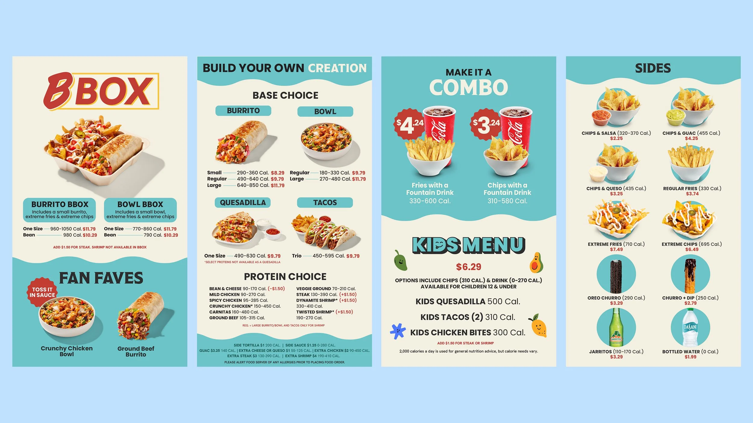
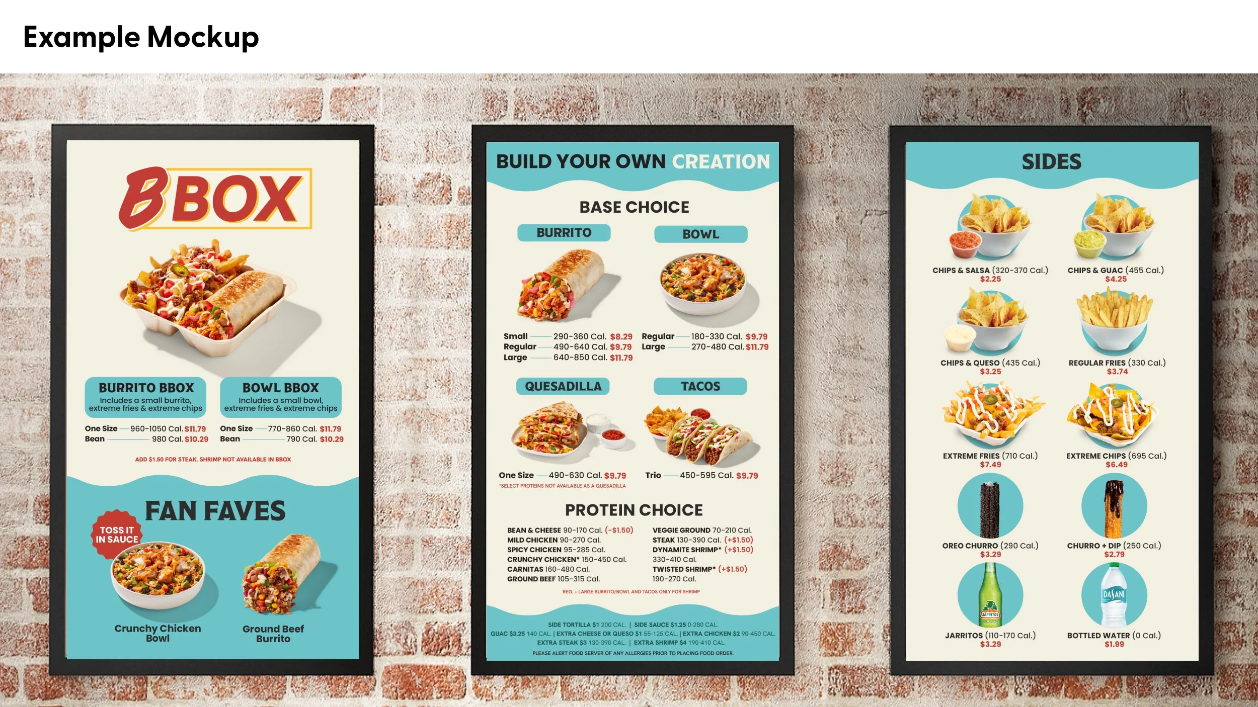
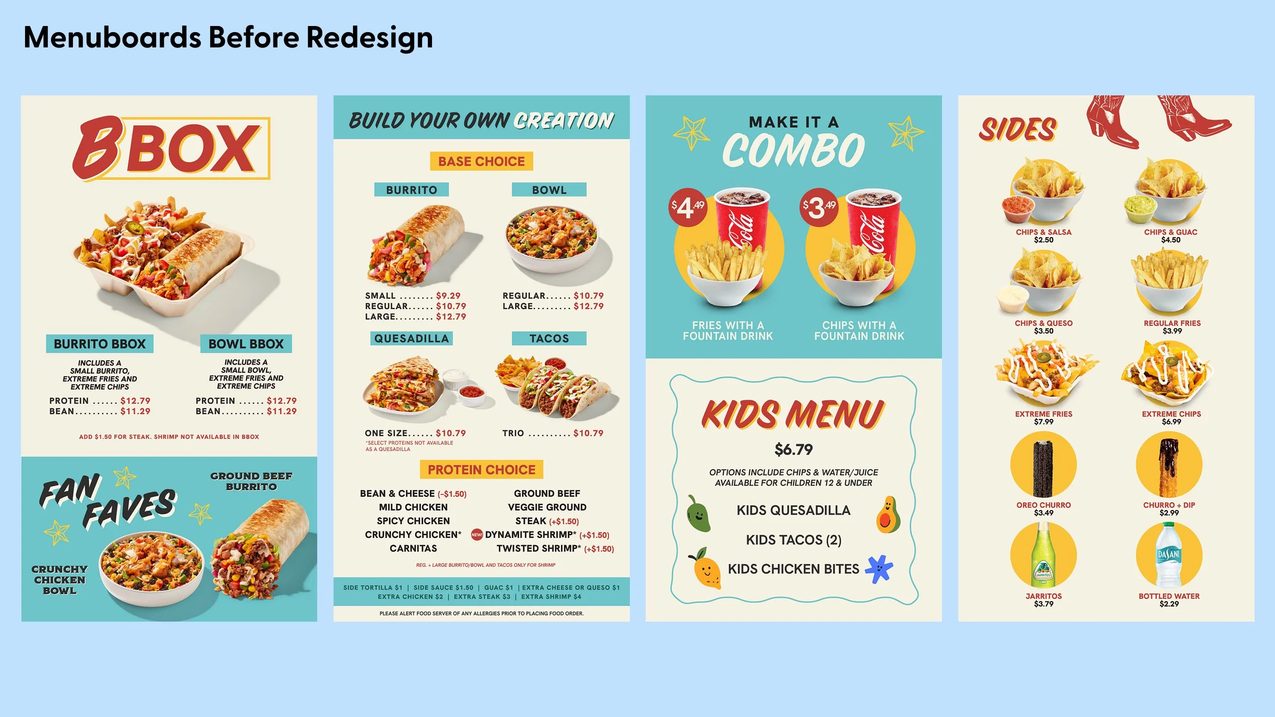

With the menuboards being a place where people need to make choices in a shorter amount of time, the previous menuboards provided an opportunity to increase visual hierarchy. Much of the update was to ensure adding in calories did not mess with visual hierarchy. More teal was used to make it an ownable colour for Barrio, new type was added to ensure the brand was updated, and wavy elements were included to align with upcoming Q1 priorities. The refresh was not meant to make the look & feel entirely different from the previous iteration, but to build off it so that customers continue to recognize Barrio as a brand.
This was a 1 month project that required 10 versions to support all the stores. It was in collaboration with the VP of marketing, Director of Operations (for calorie info), and Regional Operations Leader (for menu info).