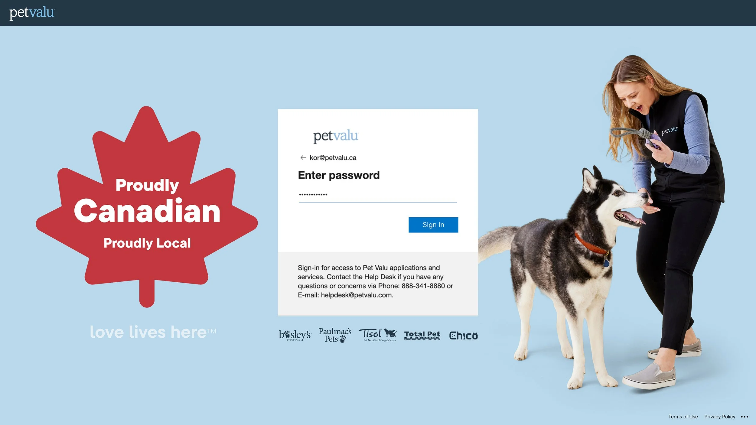
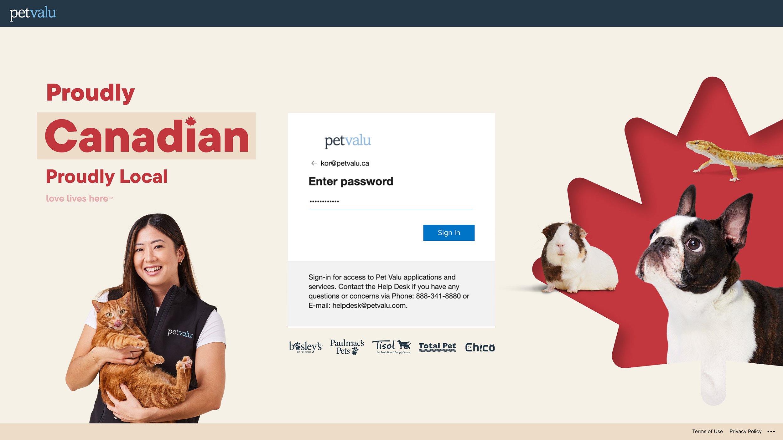
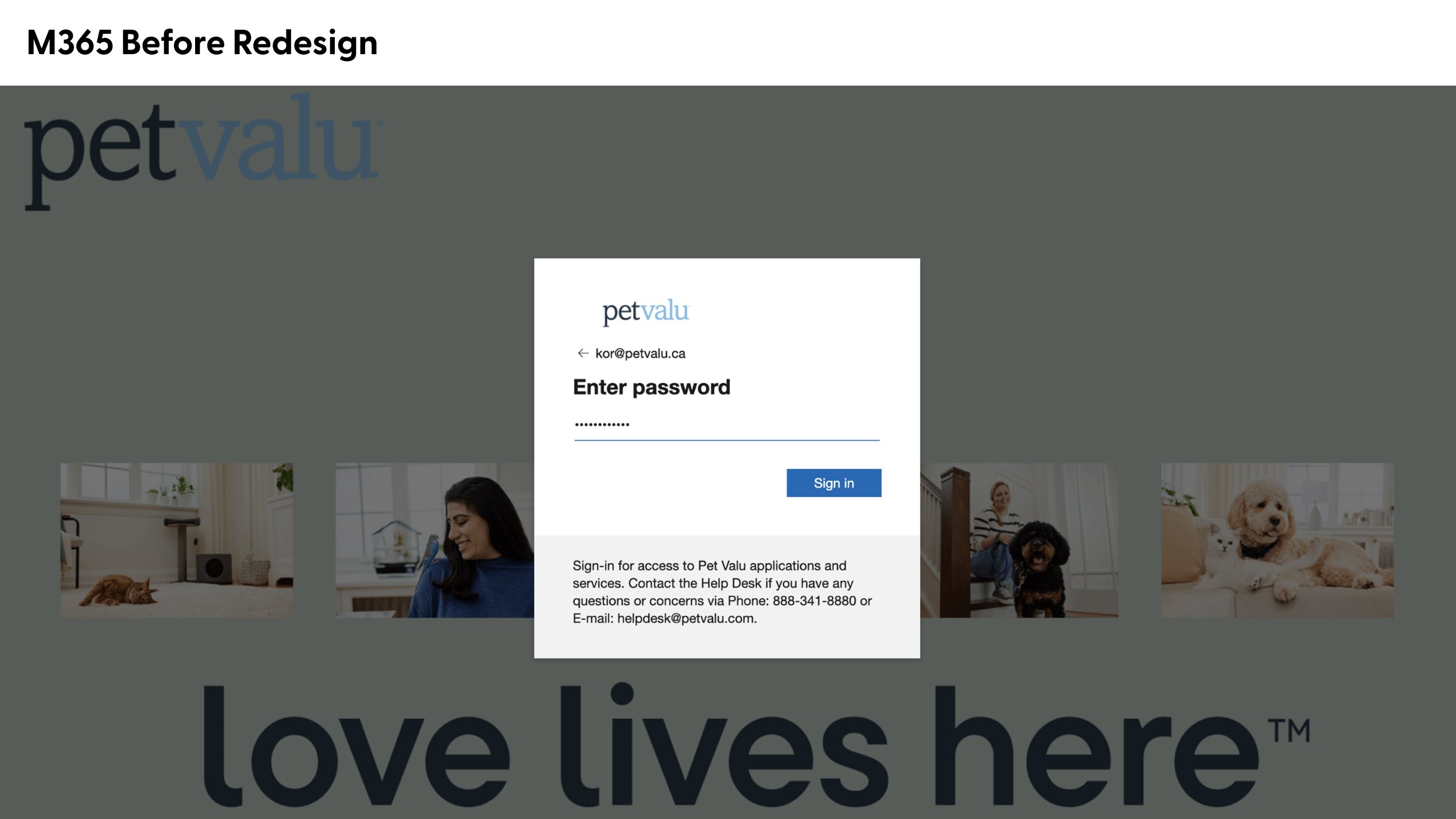

From the previous design, the use of the “love lives here” tagline as the main messaging and cropping of the lifestyle images created more opportunities to improve visual hierarchy and introduce main Pet Valu messaging.
The first version leaned into the core light blue and navy from Pet Valu’s brand colours with the Canadian messaging as secondary and the second version focuses on Pet Valu being a Canadian company. The final version used was the first one as it’s an internal facing project where only head office members see, so the Canadian messaging doesn’t need to be the main priority. Inclusion of the studio photography rather than lifestyle photography reduces visual clutter of the layout and continues to use Pet Valu’s own photo bank. There was also the opportunity to show all 5 banners that Pet Valu owns, which was included under the login.
This was a 1 week project in collaboration with the Chief Tech Offer who briefed this.